

How I made a Powerful Tool with Data-driven Design
A showcase of how data analytics can inform great design solutions:
I was asked to increase retention and conversions in a screening app -


- A screening app in need of a clever competitive edge to keep its relevance in a national market
But
I could only do this by auditing and analyzing its preexisting design first:

Auditing an Old Design
About:
The current state design for this product was antiquated and inconsistent in design and user interaction patterns.
After careful analysis several hypotheses were formed as to why user retention and conversions weren’t being met.

The Problem
HYPOTHESIS (LV1 - Informed Systems)
TIME
Jetstream’s current state design performs slowly because of its segmented, linear interaction design which becomes undesirably lengthy in sections.
DESIGN
Non-conformity to common design patterns causes hindrances for users interacting with it, correlating directly with application completion time.


The Solution
HYPOTHESIS

A simplified, less segmented, and more lateral design could address these problems. This would give users flexibility to populate information as they see fit.
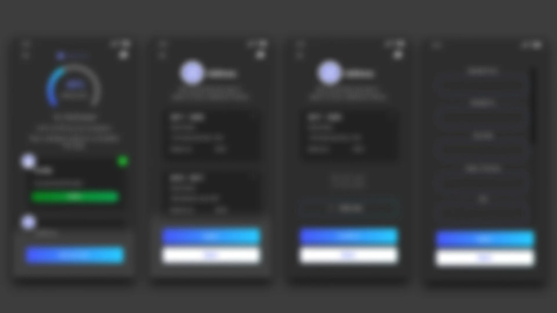
To solve the problem,
I tested my hypothesis with several divergent designs, each meant to tackle the problem in varying ways
Testing
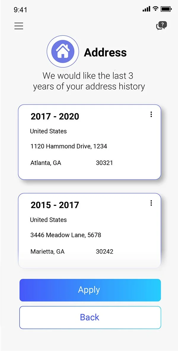
A comparative A/B test was run with Loop 11 to measure how quickly users could populate the same data into both the linear, old design and the newly proposed lateral, “Spoke & Wheel” version.

Test parameters would require the following from participants:
Desktop or Laptop user
Must reference script for contextual awareness and enter information from the shared document into tests
Native English Speaking, Reading, and Writing
Video footage of users completing the tests was analyzed over the course of a week.
After, test data was synthesized and illustrated into infographics depicting the performance results.
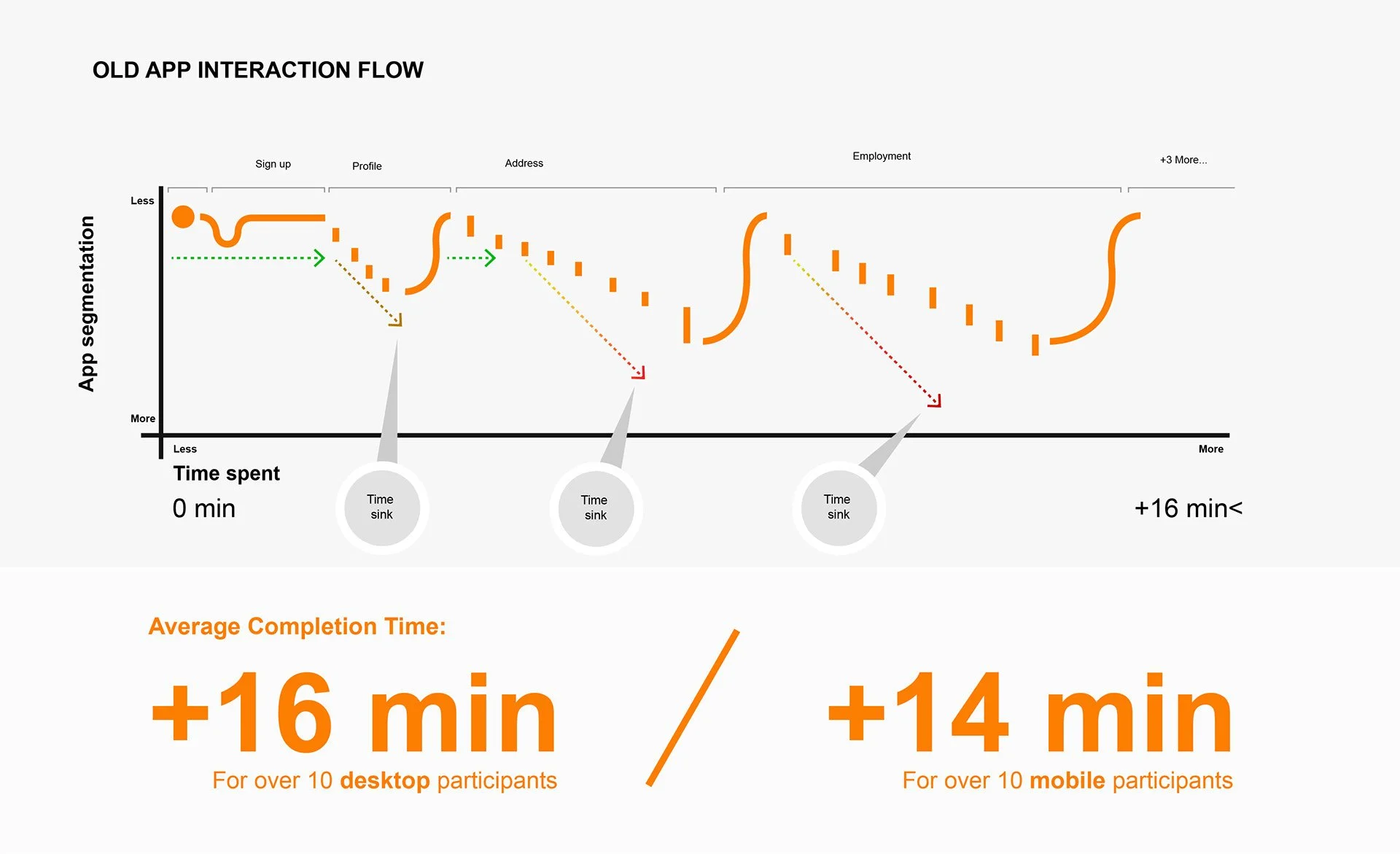
Testing Magnified
OLD INTERACTION FUNNEL

A simplified, less segmented, and more lateral design could address these problems. This would give users flexibility to populate information as they see fit.
Test Results
OVERVIEW
Overall, the Spoke & Wheel experience outperformed the current state significantly in terms of several categories such as time to complete, page count, and ease of navigation.
These metrics were gathered quantitatively and qualitatively.
SCREEN COUNT REDUCTION
SPOKE & WHEEL UX IMPROVEMENTS
I collected and visualized a quantified comparison of the amount of screens presented in each funnel (by segment) before and after.
Presented are the aggregated values behind what percentage of total screens were reduced and in which segments (address, education, etc) between mobile and desktop.


COMPLETION TIME REDUCTION
SPOKE & WHEEL UX IMPROVEMENTS
I designed info graphics translating my quantitative data findings into graphs showcasing how long it took testers to complete their tasks and where in the user journey.
Presented are the aggregated values behind what percentage of total completion times were reduced and in which segments (address, education, etc) between mobile and desktop.


Next steps
Utilize this study's aggregate data to drive the design of Jetstream starting with one of two bespoke strategies:
Quick wins & updates (Short- term "patch" approach)
Requiring PO, PM, & Dev to solidify work items in sprint to afford design efforts for this.
Reimagined design of PA (Long- term but necessary evolutionary approach)
Requiring PO, PM, & Dev to solidify work items in sprint to afford design efforts for this.

The Result:
I led research and development to a powerful solution I designed for Jetstream

This solution more than doubled the efficiency of the original product in conversion rate and end-to-end completion time.
*Note: “Jetscreen” is an alias name for another client and their product I improved based from this study

More Projects

DESIGN SYSTEMS 101
Client: Confidential

PORSCHE FINDER
Client: Porsche North America